Assignment 6

You will see a slideshow below - it will reveal your final placement.
Comments are below.
Remember, they are posted in alphabetical order based on your Simming Username. You will have to watch the slideshow to know your actual placement and if you have been eliminated or not.
Remember, they are posted in alphabetical order based on your Simming Username. You will have to watch the slideshow to know your actual placement and if you have been eliminated or not.
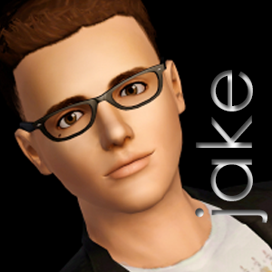
Tania Reese
by Abel

Your team did well with the makeup – although green was already done by your team last week. I also like that pouty look on your face. Here’s where the photo loses me – your pose isn’t my favorite. With a close headshot like this, having your hands where they are is awkward-looking. It also doesn’t do anything for your pretty accessories. Finally – a major requirement (that was mentioned several times) was that your background should NOT be black & white. While this may have some sort of tint to it, it looks black & white. Overall, your team did well, but creativity of pose and background seemed lacking.
|

I love how soft this photo is, especially with that pose. Your team did a great job with your make up, as well. You can clearly tell which is supposed to be the accentuated color, which was the point of the assignment. However, I wasn't particularly excited to see that you chose green again, as that was the focus color on your assignment in week 5. I think that a different color, especially because these are both being judged now, would have shown better diversity in your team and their artistic vision. Other than that, something I really wanted to see is eye contact - your team chose a photo where the angle is above your line of vision and if the camera was angled just slightly further down, it would have completely transformed the photo, in my opinion. Eye contact is critical in a competition where the photos are this close and unless it's very intentional, it's hard to understate its value.
|
Amara Hudson
by Abillings

Your team nailed this assignment, Amara! Your stylist did a fabulous job with your makeup and hair, your accessories and polish are fabulous, and you posed BEAUTIFULLY for this! You pose is so great for showing off everything, while maintaining high fashion appeal. I will say that your background was lacking creativity, but overall, that was minimal because YOU rocked the photo. Excellent job!
|
I absolutely LOVE what your hair stylist did with your hair for this assignment. It frames your face very well and the pushed back, kind of wet look really puts the focus on your face. Your pose is great and your accessories are good, I just wish your team would have picked a photo where your hand wasn't covering your necklace, because that's blocking out a big piece of your color blocking in this assignment. I think that with a less intense red earring and some rosy cheeks, your team could have pushed this picture just that little bit further.
|
Hannah Barnett
by Jendow

Very, very pretty, Hannah. I like that purple was your team’s choice and I really like that it’s everywhere on you and in different shades that work together – most of all I really like that your team went with a contrasting background. It helps to make you and your purple pop while still being creative. I do think your pose is a little tame and you are looking off-center, but overall, I think your team did very well.
|

Your team really hit the nail on the head for me, this round. You chose this purple tone that pops off the page but, despite it being the only color your model is wearing, it isn't overwhelming. I am very impressed that your team was able to find this level of balance. The eyes and lips are soft, not too harsh of a color, while clothes and earrings and nails are harsher but balance out the subtle tones. Your pastel background really tied it together for me, making this feel like a very light and airy picture. I have one thing to note and this is something that happened for your team with both assignments this week is that the flowers are of a different quality and material it seems. Being very cautious about that is going to be important as you proceed further in the competition.
|
Victoria Venice
by Jojo
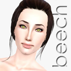
Victoria, your team NEVER ceases to amaze me with the high fashion aspect. You really look fabulous here and you posed very interestingly. I like the hair and everything else on you very much!! Here’s my complaint – the background. I would have liked it to be a muted color (as required) gradient rather than matching the teal/turquoise that’s all over you. You were supposed to pop out of the background and with a matching teal/turquoise color you don’t. Other than that, you and your team should be very pleased with your photo.
|

You and your team did a beautiful job with this assignment. Bringing up your arms in that post was a great way to make such a close headshot more appealing and there was a good fluidity with your colors. There was a lot of gradienting which helped to diffuse the intensity of the color you chose, but I wish you had chosen a few more things to offset the color balance. Maybe some soft white eyeliner or maybe your team could have played around with the bracelet choice. A solid silver band could have helped to maintain the metallic nature while offsetting the color a little more. Overall, I'm pleased with this photo though. Your team did well.
|
Baylee Jefferson
by Mizzie

Baylee, you really look fabulous here and your makeup artist has some serious talent with eye-shadow. Here’s the thing for me…your background is a bit boring and seems an odd choice and your hair (while beautiful) detracts from the blue color that’s supposed to be your main focus. Your hair should have been subdued as well if you really wanted us to focus on the blue color. I do like your accessory though!
|

It's soft, it's subtle, your hair offsets it just right - your team did an amazing job with this one. The white dots of eyeliner could have used a little touching up (in something this close, even the smallest details can portray the biggest flaws) and maybe your team could have gone with a more subdued wood background, fading it out a little more, but it doesn't distract too much. Your costuming team did great with the ear piece though. It really ties together the look and sets it apart in terms of high fashion. Your team had great balance this time around and I look forward to seeing future work from you.
|
Angela Marlow
by Nshipp

You definitely pop! I guess this was probably the best assignment for your beautifully unique hair. I like all the blue and think you did a good job with the shades, however, I feel that the blue is a bit TOO much. This might have been better for assignment 5. I think your hair, makeup, and nails were just the right amount of blue, but that the dress added too much. Your background, while different from the rest of you, is an odd choice – it’s kind of bland and boring. I do like your pose and the eye contact though.
|

You and your team truly did a great job on this assignment! You took the color you wanted and really brought it to life through the picture. The issue is you all did it a little too well. Every blue in this photo was very intense and when the photo is this close, there isn't a lot to diffuse the color. Had your team chosen something softer for your blouse and maybe even not have made your headpiece blue at all, that really would have helped the photo. I think if those were white crystals as opposed to blue, it would have been a great way to offset the colors, especially since it almost gets lost in your hair. Also your make up team did take the assignment a little too literally as well - it's okay to use some natural colored make up on your cheeks and lips, especially when there's this much color elsewhere. You have a lot of potential and don't be afraid to get a little liberal with the guidelines sometimes.
|
Emily Thomas
by Penguin

I like the vibrant purple/magenta color and the dust that you’re tossing. I think that your team did well with that idea. However, your background is just black…it’s not a muted background it’s just black…and your expression is void of ANY emotion! I would think that if you’re tossing sparkles you might be excited about it? As a whole, I liked this, but I don’t think it was as strong as some of your past entries.
|

Your team made some really good choices in keeping your hair dark, keeping the background dark, and choosing such a vibrant color. It really did pop off the screen. However, I felt like this wasn't a strong entry as a whole. Your face is blank and void of emotion - i think that, especially because it looks like you're tossing the flowers, some sort of joyous expression would have been better suited for the photo. Opposite of that, had you been dropping the flowers over your face, a devilish smirk could have been used to spice it up. I'm a big sucker for eye contact, especially when a photo is this close, and I think that would have helped you out too. A lot of good choices were made by your team but I felt like they ultimately didn't choose the best picture you could have worked with.
|
Marlee Matson
by SimsORIGfan

Love your hair, Marlee! I really like that color and style on you. I also like that you chose a different route with the less vibrant color choice. There is an odd blur/smudge thing going on along the right side of your face, which is distracting and the shadow on the star makes it look like it’s floating, not a hair piece. Your expression is cute, but you are looking oddly up a bit and those crystals…OUCH! They have to hurt that close to your eyes. I think they were a bit oddly placed and were more of a distraction than an asset. Your background choice was a good one, though.
|

I'm really, really glad that your team didn't choose an intense color. That really set you apart because it already gave your picture a softer look and feel. However, don't those crystals hurt your eyes?! They're really close and very large - I think your team could have done without putting them where they did. Perhaps doing a sideways silhouette with the crystals highlighting your jaw would have been a better choice, stylistically and in terms of personal comfort, haha! The shadow on the big star that I think your team edited in made it seem like it was floating off of your head, so that's something to be cautious of in the future. Reference pictures when editing are really important. Other than that, it seemed like the texture of your hair was smudged in areas and that was distracting, especially in such a close up photo. However, overall again, I really did enjoy this photo and how you used a color that set you apart.
|
Haeju Sorenson
by Strawberrigurl

If I were to look at this photo outside of this assignment, I’d think this was AMAZING. You are posed beautifully, your expression is great, your eye contact is PHENOMENAL, the colors chosen are beautiful and beautifully executed, and the photo just rocks overall. The issue here is that while you chose some bright purples, it doesn’t pop as much as I’d like because the whole photo has a sort of purple hue going on. Even your skin is slightly purple tinted. I think if you had chosen a background that had more of a silver or golden tone and then left out the purple tint filter, this would have been at the very top of the ranks this round. I love this photo, but technically speaking this doesn’t quite match what was required due to that darn purple hue!
|

Beautiful quality for this assignment and a STUNNING pose. I was very happy with this eye contact we see. I think overall you and your team did a good job but I also feel like this is missing a big wow factor for me. Perhaps a bigger accessory or a necklace that could have offset the color because it does feel a little too purple for my taste. I would have been more impressed if you and your team chose a different color than purple since its so complementary of your skin tone. That would have shown some good diversity. Also, as just a little note, it seems your editing team went a little too intense on smoothing out the hair at the top of your head - there's very little definition in the strands of hair which, at this close of a photo, can really be an important thing to be able to see.
|
